|
 |
|---|---|
 |
 |
Showing posts with label Publication design. Show all posts
Showing posts with label Publication design. Show all posts
Sunday, November 17, 2013

Thursday, June 27, 2013
Special publications in 2012
It's been a crazy year (OK almost two), but I am working full time at The Eagle now. Here are some of the projects I did in 2012.
Honoring Heroes, Veterans tab for 2012 I did all the design, cover and inside pages, copy edited and wrote headlines.
and Aggie Playbook for the SEC, 2012 For the Aggies inaugural season in the Southeastern Conference, The Eagle put out a magazine (on glossy paper!). I designed all pages except for the game board in the back.
And Johnny Manziel: Road to the Heisman. After a whirlwind of a season, not only did the Aggies hold their own during their first season in the SEC, but the youngest player to ever win the Heisman brought it back to Aggieland. On this commemorative issue, I designed the cover and a majority of the inside pages.
Honoring Heroes, Veterans tab for 2012 I did all the design, cover and inside pages, copy edited and wrote headlines.
and Aggie Playbook for the SEC, 2012 For the Aggies inaugural season in the Southeastern Conference, The Eagle put out a magazine (on glossy paper!). I designed all pages except for the game board in the back.
And Johnny Manziel: Road to the Heisman. After a whirlwind of a season, not only did the Aggies hold their own during their first season in the SEC, but the youngest player to ever win the Heisman brought it back to Aggieland. On this commemorative issue, I designed the cover and a majority of the inside pages.
Tuesday, February 1, 2011
San Marcos Stars
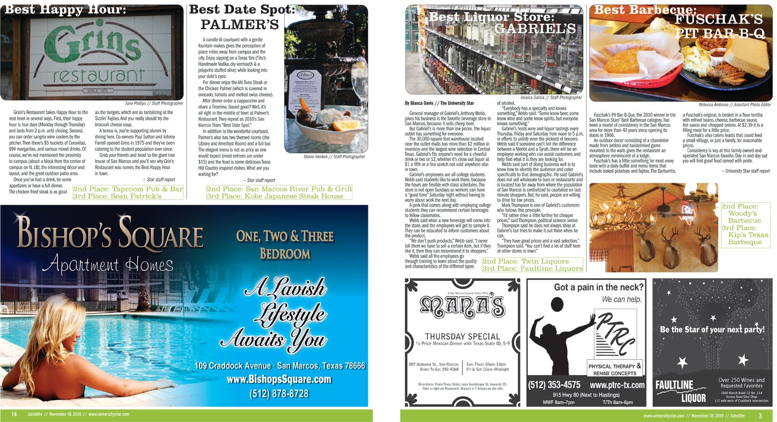
Here is the San Marcos Stars issue of the advertising supplement Satellite. I oversee the production of Satellite for The Star. In this issue, readers previously voted online at universitystar.com who their favorite local business is for a particular category.
In this particular issue, and why I am posting this, I designed the entire issue myself, front to back, minus the ads, in a very long day. Usually design on Satellite is done by the graphic designers. I also did quite a bit of editing on this issue. The cover is a play off of the house ad that was done by the advertising coordinator. When coordinating these issues, I like to try to use the same theme from the promotional house ads to make the whole product come full circle.
It's a labor of love. Therefore, I'm posting the whole issue. Click on the images to get a closer look.


In this particular issue, and why I am posting this, I designed the entire issue myself, front to back, minus the ads, in a very long day. Usually design on Satellite is done by the graphic designers. I also did quite a bit of editing on this issue. The cover is a play off of the house ad that was done by the advertising coordinator. When coordinating these issues, I like to try to use the same theme from the promotional house ads to make the whole product come full circle.
It's a labor of love. Therefore, I'm posting the whole issue. Click on the images to get a closer look.




Sunday, January 30, 2011
Internship pt. 4
Here are a few inside pages from the 16-page spread Back to School issue. I was able to copy them from The Eagle's website. So the ads are there.
A lot of the content was school supply and contact lists, football schedules, etc., and i had to do a lot of reformatting the text to get what I could to fit. I took care to make sure a list or calendar did not cut off in the middle of a school subheading, meaning all the supplies and contacts are there for the school listed. The rest of the schools were put online.
*I tried to include clipart where I could to brighten up the pages and break up the text.

*This page had a triangle ad they gave me the hardest time when giving it enough gutter space. I took care to pay attention to the text spacing along the hypotenuse.


A lot of the content was school supply and contact lists, football schedules, etc., and i had to do a lot of reformatting the text to get what I could to fit. I took care to make sure a list or calendar did not cut off in the middle of a school subheading, meaning all the supplies and contacts are there for the school listed. The rest of the schools were put online.
*I tried to include clipart where I could to brighten up the pages and break up the text.

*This page had a triangle ad they gave me the hardest time when giving it enough gutter space. I took care to pay attention to the text spacing along the hypotenuse.


Internship - pt. 3
Here are a few of the inside pages for Land and Livestock Post, minus the advertising. I copy edited, wrote headlines, and did layout design for the 22-page spread. The LLP already had a standard look and format, including its house ads. However, because I did not have the freedom to adjust the ads to the space I needed them to, and the ads just looked to be out of date. So I made some of my own using the photos already on the LLP photos on the server. I learned a lot about QuarkXPress and NewsEdit Pro during the production and became more comfortable with what I had already learned.
Click on the images to get a closer look.


*Notice the house ad on page below

*This is the center spread/main feature. It was on the drought and how the area had seen an unusually high amount of rainfall.


Click on the images to get a closer look.


*Notice the house ad on page below

*This is the center spread/main feature. It was on the drought and how the area had seen an unusually high amount of rainfall.


Saturday, January 29, 2011
Internship - pt. 2
Here are the section fronts and front page I completed. I not only designed, but I copy edited and wrote headlines. Although, right now I don't remember which headlines I did write.
Click on the images to get a closer look.


Click on the images to get a closer look.


Intership - pt. 1
I know it's been a long time and these are a little late, but here is an update on my life and portfolio.
I've now completed the first semester of my senior year, and crunch time is starting to find a job for after graduation.
Over the summer, I completed an internship at The Eagle in Bryan. I did copy editing and layout design. Because The Eagle is not a large newspaper, I feel like I had more opportunity to learn and be useful. I earned the opportunity to work on and design a few front pages for the region section and even a front page.
After a month of working at The Eagle, I was asked to design the July 1 issue of Land and Livestock Post, a bimonthly, agriculture publication. A month later, the editor asked me to help out and do the inside pages of the Back to School issue.
I've now completed the first semester of my senior year, and crunch time is starting to find a job for after graduation.
Over the summer, I completed an internship at The Eagle in Bryan. I did copy editing and layout design. Because The Eagle is not a large newspaper, I feel like I had more opportunity to learn and be useful. I earned the opportunity to work on and design a few front pages for the region section and even a front page.
After a month of working at The Eagle, I was asked to design the July 1 issue of Land and Livestock Post, a bimonthly, agriculture publication. A month later, the editor asked me to help out and do the inside pages of the Back to School issue.
Tuesday, February 23, 2010
Throw back pt 1
The images of the three parts titled "Throw back" took a lot of time, blood, sweat and tears (well maybe not blood).
These are only selected pages from a bigger 26-page final project for a publication design course I took fall '09. All the body text is filler. I wrote the headlines and researched my topics.
The topic of calligraphy sparked my interest because I have the habit of being "font happy" until I take a step back. The course made me realize less is better, white space can be to your advantage and to be consistent with a typeface. I had an interest in design (it really keys into my attention to detail) before I took the class and a basic understanding of InDesign, but the course and the instructor's patience really broadened my skills and perspective.
All the Daniel Reeve images are from his site. I did all the cut outs and placement myself. This is just a class project and not meant for profit. I am posting this project to portray creativity and skill. Click on the images for a closer look.

Above is the front page of the magazine project. Pictured is Daniel Reeve, calligrapher and cartographer, who is the main feature of this issue. I created the image by overlaying two copies, one in color and the other in grayscale, and erasing from the top, grayscale layer so the map would come through in color.
After putting in "famous calligraphers" into Google, I came across a site that had some listed. I plugged a few in and I was inspired. Daniel Reeve is a New Zealand native and the creator of typefaces for several movies and extended merchandise. Most notably the Lord of the Rings trilogy and Narnia: The Lion, the Witch, and the Wardrobe. I had seen all the movies (whether I wanted to or not) and it played into my nerdy side as well.
Below are the inside feature spreads about Daniel Reeve. Only the feature spreads pertaining to Reeve have a parchment background.


Throw back pt2


Throw back pt 3
These are some of the feature spreads from my project.
Click on the image for a close up


The pages above and below are features on two of the three main types of calligraphy. I found the zoomorphic to be very interesting.


Monday, February 8, 2010
Typography

This is a typography project I did fall '09 for publication and design class. I pulled complementary colors from the text that also went well for the background image.
The background image is from the inside of a windshield. I knew I wanted the bug guts to be the only thing with red.
This project was the first for my class and it really made me tone it down when it came to fonts. One typeface can be manipulated to look different, as in italics or bold for example. I tried to make the word "windshield" appear elongated. I also lowered the kerning between the letters in bug to give the impression of a squished bug, as the photo suggests.
Subscribe to:
Posts (Atom)