The images of the three parts titled "Throw back" took a lot of time, blood, sweat and tears (well maybe not blood).
These are only selected pages from a bigger 26-page final project for a publication design course I took fall '09. All the body text is filler. I wrote the headlines and researched my topics.
The topic of calligraphy sparked my interest because I have the habit of being "font happy" until I take a step back. The course made me realize less is better, white space can be to your advantage and to be consistent with a typeface. I had an interest in design (it really keys into my attention to detail) before I took the class and a basic understanding of InDesign, but the course and the instructor's patience really broadened my skills and perspective.
All the Daniel Reeve images are from his site. I did all the cut outs and placement myself. This is just a class project and not meant for profit. I am posting this project to portray creativity and skill. Click on the images for a closer look.
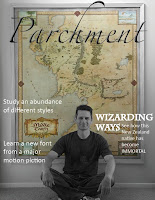
Above is the front page of the magazine project. Pictured is Daniel Reeve, calligrapher and cartographer, who is the main feature of this issue. I created the image by overlaying two copies, one in color and the other in grayscale, and erasing from the top, grayscale layer so the map would come through in color.
After putting in "famous calligraphers" into Google, I came across a site that had some listed. I plugged a few in and I was inspired. Daniel Reeve is a New Zealand native and the creator of typefaces for several movies and extended merchandise. Most notably the Lord of the Rings trilogy and Narnia: The Lion, the Witch, and the Wardrobe. I had seen all the movies (whether I wanted to or not) and it played into my nerdy side as well.
Below are the inside feature spreads about Daniel Reeve. Only the feature spreads pertaining to Reeve have a parchment background.

The spread below is of a side project by Reeve. He is a New Zealand native, and as a cartographer he was asked to replicate the country's founding document for exhibits.